Navine G. Khan-Dossos
Can painting address the current state of the world, the strategies in use in the media, the situation of information with the same relevance as so-called new media art for instance?
Do the structures of propaganda differ not only in terms of content but also in terms of design between the Middle-Eastern and the Western societies? And could there be any common trait to decipher between radical Islamism and the conservatism set up by the new president of the USA?
On the occasion of her first solo exhibition at NOME in Berlin, we met Navine G. Khan-Dossos to discuss these issues and many more, as her latest series of works takes its inspiration from the online magazine Dabiq, which is an IS (Islamic State) propaganda tool aimed at Westerners.

My TV Ain’t HD, That’s Too Real, 2015. Installation view at Witte de With, Rotterdam. Photo:Cassander Eeftinck-Schattenkerk.
How did you come to choose studying traditional Islamic art on a practical level?
After a BA in History of Art studying Ottoman art and architecture, I felt that if I wanted to incorporate some aspect of the aesthetics and ideas behind Islamic art into my own practice, it was important to learn some of the crafts at the heart of this tradition. My aim was never to be a craftsperson, or to continue in the style of Islamic art, but to understand the conceptual frameworks and physical processes. It is almost impossible to truly understand how an object is made unless you have tried to copy or reformulate it physically. After a year at the Prince’s School of Traditional art in London, I had a working knowledge of geometry, ceramics, mosaics, calligraphy, gilding, and miniature painting. All of these skills have informed my practice over the years, particularly the meditative aspect of the making process, even if they aren’t as apparent on the surface of my work as they once were.
It’s been a while now that Islamic patterns are filling your work, can you unravel your application of them between decorative and meaningful purposes, tracing it back to the series Converts (2014) or My TV Ain’t HD, That’s Too Real (2015), for instance?
These two series of work were made while I was in residency at the Van Eyck Academie in Maastricht. During that time I moved away from using traditional Islamic motifs and patterns, instead finding new forms in the images and diagrams found on the Internet that spoke an alternative symbolic language; one more rooted in the world we all live in. By repeating these motifs and generating patterns out of them, I seek to highlight and simultaneously strip their meaning, providing a space where the viewer is given the space to create new parallel understandings of the motif. Each pattern has its own language, its own research and history, but is rarely seen in such a ‘dazzling’ repetition. Symbols such as the Twitter bird logo, US medals for Middle Eastern campaigns, camouflage patterns and satellite pathways relate directly to the subject matter of the work. The title maintains a direct relationship with that subject matter. It is up to the viewer to unpick the pattern if they choose to.

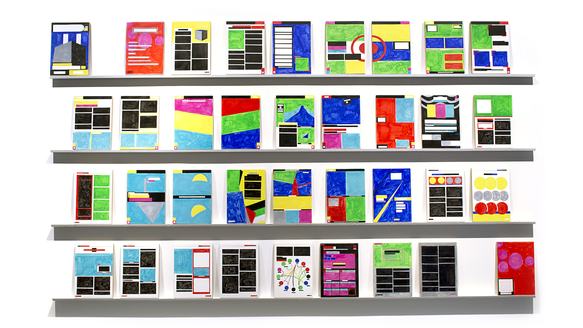
Converts, a cycle of 36 wall paintings completed at the Jan Van Eyck Academie, Maastricht, 2014-2015.
Could we possibly think of your work as a kind of political neo-orientalism?
I’m always wary of this need to see my work in relation to Orientalism for the simple reason that it lessens its scope, both for myself as the maker, and for the viewer. If there is any place for this term, it is that my new works reflect the political neo-orientalism being used by the media, on both sides of the debate about Islam. In Dabiq, and more recently in Rumiyah magazine, both produced by the media wing of ISIS, we see Islamic-inspired designs playing a new role in the graphics, this time as a form of authority that defines its content. The use of such visual language is part of a black mirror effect, reflecting back to the West the Orientalist ideas of the past into a current form, redefined but self-determined for the age of terror we now find ourselves caught up in.
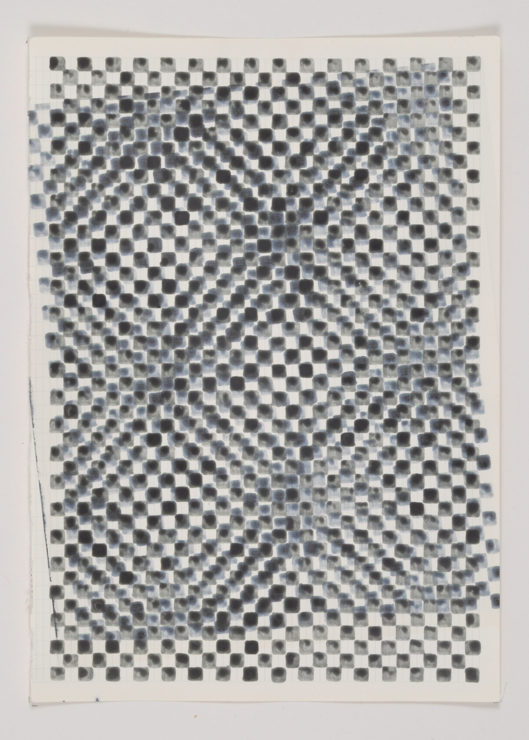
Printer Drawing VIII, 2013, oak gall ink and printer ink on paper, 15 x 21cm.
Precisely, in your most recent series of paintings on display at NOME, Expanding and Remaining (2016), there’s absolutely no hint of any Middle East graphic influence, rather a direct continuation of the research that has been developed through series such as Grid Paintings (2012), Printer Test Sheets or Printer Paintings (both from 2013) —the latter also shown at NOME— which look closely at the mechanisms at stake in the apparition of the image, needless to say I employ the word apparition for its religious connotation…
Dabiq and Rumiyah both exist as PDF, so they get distributed mostly in the West, but there are very big parts of the world that don’t have that literacy or even bandwith and actually they aren’t circulated in Syria or in Irak in this form. Most of the forms of propaganda that circulate in these territories are physical, printed. There’s a very big difference between the online and the offline propaganda machine: the online propaganda machine is for the West, and the offline is aimed at the local community.
The Grid Paintings, Printer Test Sheets and Printer Paintings all seek out the point before the page is printed, the potential of all images to come after the calibration test sheet is printed by our domestic machines. It is a subtractive attempt to look at the building blocks of printed matter and consider them a subject in its own right.
So not only the content but also the design of propaganda magazines aimed at Western countries is different?
Yes, very different. The mechanisms of print are still as important for image making as the mechanisms of the screen, that’s why my palette is made up of CMYK and RGB: to explore the tension between the digital and the printed image.
The print I’m talking about is computer-based, it’s not the printing press. Actually, I collect calibration targets off packaging. I rip them off, they’re really important for me, they’re key to my thinking about the image.
I see the IS flag as a form of calibration target that aligns all of the different propaganda materials. You know, many propaganda videos are made by lone wolves, before they martyr themselves, and they often have a little printed flag in the background, pinned on the wall. The home printer is crucial in all of this. There’s no physical professional copy of Dabiq you can read, it’s always spread as a pdf, but I’m sure there are, somewhere, people who have printed each issue out and meticulously bound them. It has to be home-made. You can’t go to a print shop and have it done there; it’s illegal material.
Even if it’s in Syria or in Iraq?
Well, possibly, but it’s in English, so it’s unlikely that it will be printed there anyway. This is for a Western audience. And it’s a much more dangerous object as a physical object than it is as a digital object, it feels more frightening if somebody finds a hard copy in your bag than a PDF on your hard drive. There’s something tempting and terrifying as having it as an object.
So for you, as well as a matter of “copying or reformulating it physically” to better understand it, to quote your own words, Expanding and Remaining was also a matter of incarnating these digital pages, of giving them a weight and, with it, a way more physical presence than a simple printing could have done.
They’re all painted on icon boards made in Athens where I live. There’s a healthy tradition of icon painting here so the materials for that are common and right up my street. I had these ones made to match the size of the magazine sheets, so it’s about the same size as a copy of any kind of glossy magazine, slightly bigger than A4.
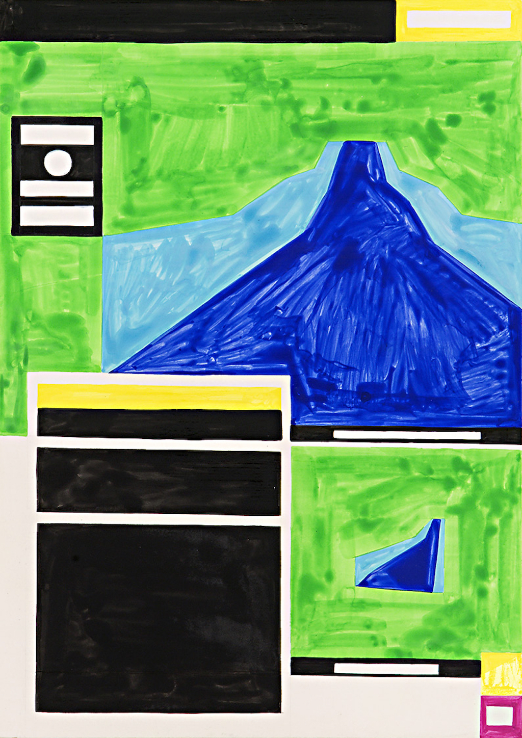
I also use the similar techniques to icon paintings but in this case gouache instead of egg tempera. They lean on wooden shelves mimicking the display of an editorial office when it’s time to think of the layout of the pages for the next issue. So in the display, they don’t necesserarily have to be perfectly aligned, there’s a possibility for movement that is included. But there’s a narrative arc in this series of paintings that follows the general structure of the magazine. All these “pages” are mostly from the fifth issue of Dabiq, titled “Remaining and Expanding”.


Installation views at NOME, Berlin.
Did you choose this specific issue for its subject or for its design?
For its design. I think issue 5 is the high point of this aesthetic. They had done enough issues to get a style, before it changed over time again for reasons we can only speculate. And there are few pieces that are taken from other magazines which I thought were important enough and compositionally interesting. It’s a kind of amalgam but mainly based on that one issue.
Technically, how do you procede? You pre-work on the PDF on your computer and then project the structure?
I take each page I’m using out of the PDF and I box up the sections in Photoshop, primarily because I don’t want to have them in raw format in my studio. I don’t see the need to have images of dead bodies or hostages on my studio walls whilst I make the work. The imprint has already been left on me; it doesn’t need repeating any further. So I mask the areas creating the basic blocks I’ll be working with and I transfer the image. So, with every process there’s a removal from the original material : they end up quite abstracted from the original.
We’re here in a very traditional description of abstraction, close to the definition given in philosophy too. But would you refer to your paintings and to this series in particular, as abstract? Does that term still appear relevant to you?
I have never really felt that abstraction is relevant to my work, certainly not in the western art historical sense of the word. The work is information derived from its subject, so we might be better off thinking of them as informational images. They contain, if not data, some form of material that relates to the subject of the work. The colours, the shapes and forms are the conceptual framework coming directly from material in the real world. I also often use the term aniconism rather than abstraction to talk about the work being non-figurative, but not strictly abstract.

Give You My Lovin’, 2013. Installation view at NOME, Berlin.
So when you talk about Agnes Martin, Peter Halley and Wade Guyton being highly influencial on you, what is at stake then?
These are artists whose work I have spent considerable amounts of time thinking about, and how their works sit in a gallery. When I look at a fellow artist’s work, I think about it in terms of time. Both the time taken to make the work, and also, as a viewer of that work, how I am held in front of it. These artists could hardly be more different materially, but somehow the works all hold my attention in a similar way. I become absorbed by them, by their surfaces, by their labour, their industry. And I take something of that away with me to my own studio. Most recently I have also been very nourished by Suzanne Treister’s work. Her use of watercolour in a deeply political realm of subject matter helps me remain firm in my own material choices.

You’re Just A Headline To Me, 2013.
Gouache on wood, 122 x 122 x 6cm. Installation view at NOME, Berlin.
To come back to the technical aspects of Expanding and Remaining, what kind of “transfer” of the image are you using, is this mechanical?
I transfer the image just by taking its measurements across the board. As much as possible, I try to go back to a position of making everything by hand and not relying on projections.

The Fight Against The PKK I, 2016. Gouache on panel, 25 x 35 x 1.5cm. Courtesy NOME, Berlin.
Why ?
Because I like what happens, I like all the “mistakes”. That’s where the interest is, for me. If not, it just becomes painting by numbers. And you also learn so much through measuring the margins and seeing that one column of text is slightly higher than another. It teaches you about the methods of graphic design used. You can see where mistakes were made.
When I spend time making works like these, I also think about who’s made it at the other end of the production line. The paintings are made quite quickly because I try to imagine how much time the graphic designer of Dabiq spends on each page and, to be honest, I don’t think that he spends hours on it. I think he spends on average maybe a few hours on each page, so I try to keep the painting in the same temporal reality, I make the painting in the same amount of time I estimate that they used to make the page.
I want the paintings to feel they were made with the same urgency. If not, they would be incredibly precise and impossibly perfect, and I don’t want that because the original material isn’t perfect.
When you really look at them, they’ve got a pace to them that is a working pace. A get-the-job-done pace. It’s the overall effect of the whole magazine rather than each individual page that counts. It’s not a matter of being exact. I don’t want to eulogize the original material, and for me that’s to do with time.
Would that mean that, for you, painting has to be a sort of mirror of the original material that inspired it?
Yes it can certainly be that. And not necessarily only that. It has to exist in the world as something in its own right, not just a pointer to research or content.
A Window into Islamic State, 2016. Courtesy NOME, Berlin.
So you like the idea that people could see them as sorts of pre-layout for the design rather than seing them as some pages that could’ve been written on and opacified…
I don’t want them to look as if something’s been censored. There’s so much work now about redaction where text is blocked out and my work’s not about that. Which is why, even when there’s black, it’s not dark, you can see the painterly quality of it so these paintings are not an act of repression.
Maybe you’re right, maybe it’s pre-image or maybe it’s post-image, as you’d need the information in order to extract it. The graphic designer doesn’t design a layout and then insert the images in. He or she is reacting to the images and placing them depending on the content they present. So this is probably more post-content.
In this one (A Window Into The Islamic State), for example, there’s a picture of a bridge that was bombed, so this is a before/after picture but I thought the perspective of the photograph as being key to the composition. So in some cases, I’ve kept more of the inward structures.

Al Hayat Media Centre,
2016. Gouache on panel, 25 x 35 x 1.5cm. Courtesy NOME, Berlin.

Top Ten Al Hayat Videos, 2016. Gouache on panel, 25 x 35 x 1.5cm. Courtesy NOME, Berlin.
And each of them has a title?
Yes, each painting’s title is the name of the article “depicted”. They all are pretty explicit. I don’t change the wording of the article title at all.
What’s interesting is that Dabiq follows the narrative of any magazine: you have the cover, the contents page, a foreword from the editor, then you have recent news, then military related articles and then a series of articles about life in the interior, then you have this section about destructions, then adverts for their Youtube channels, for their radio, and articles about the future (in this particular issue, one about a new currency they’re setting up), then a long four page article by John Cantlie who’s the British hostage still held by IS and used in many propaganda material (he appears as a Westerner speaking on behalf of IS who has been abandoned by the West and has taken on the kind of morality of IS). Then you have this infographic about the relationship between different countries who have an interest in the region which is copied from The Wall Street Journal, and then another advert. And finally, you have a piece written by women for women entitled “From Our Sisters: Slave or Prostitute?” which examines the way to treat Yezidi women when they’re captured, but it’s mainly about using women to justify the use of women.

Strange Bedfellows, 2016. Gouache on panel, 25 x 35 x 1.5cm. Courtesy NOME, Berlin.
This series of paintings is based on an issue which was published at the point when IS was really expanding, but the magazine shut down last October, weeks before the NOME show opened. I have a feeling that this is because the editorial office has been destroyed, as new publications have come out since then. If you look closely at the PDF, you can see they’re not made using InDesign package for Mac anymore, but for Windows. So maybe the computers have been destroyed in a drone strike and, with it, all the information used to make it. But there’s no more precise information about it to be found. We can only speculate.
What did you intend to demonstrate, if so, with this work?
Dabiq is how IS wants to portray itself to the West. This kind of magazine is produced because their producers know there is an audience for it. My paintings are a way to react to it without reproducing the primary source material, by that I mean the images of executions that circulate so widely online. It uses the composition of it but tries to find a language to talk about it that comes out of its own subjectivity, from a structural level rather than from a content level. We know what the content is, we don’t need to repeat it. But looking at the structures of propaganda helps us to understand what underpins them rather than what it purports to be.
And I think painting is a really important medium for this. Instead of using exactly the same medium it’s based on, it allows a transformation to happen. I know I’m probably quite old-fashioned about this but I do believe that art should be transformative, and for me, the act of painting transforms the subject into something else.

If I Were The US President Today (John Cantlie) I, 2016. Gouache on panel, 25 x 35 x 1.5cm. Courtesy NOME, Berlin.
So what did you learn by unpicking the graphic structures of this specific propaganda tool?
I understood something about how it was made. By that I don’t necessarily mean just the programmes, but more the context. I started to feel the speed at which it was made. Often new magazine issues come out straight after a big media event, such as the Paris bombings. So in order to capitalise on this event, they publish almost the next day or week, so the turnover of the issue is fast. I was confronted by what it must be like to produce a magazine under these conditions and this time constraint. It made me aware of all the strands that are pulled together from local offices to a central editorial point. And my concentrating on the lines and symmetries of the layouts, I saw the little mistakes, the human errors that suggest a worker under pressure to perform. That moment of labour, for me, made it human again.
Also makes it pretty uncomfortably close to more regular press too… Working with the same urgency.
Are you afraid of showing this, in a way?
This work is about confronting fear. This is not only true of IS, this is also true of last week (that is to say the election of Donald Trump as the first part of this conversation happened on November 15, 2016). People are fearful with this kind of ultra conservativism. This is one end of the spectrum of what’s happening on a global scale: am I more fearful of IS or of the kind of popularist right-wing government that is taking over the US? Aren’t they patently connected? By confronting one side that seems far away from us, are we not also looking closer to home too?

On The Destruction of Shirk II, 2016. Gouache on panel, 25 x 35 x 1.5cm. Courtesy NOME, Berlin.
This is not a satire. This is not a form of counter-propaganda, it’s not anti IS per se. It’s about creating a space of understanding of this subject, of this phenomenon. There’s someone on a computer doing this, somewhere. And that, as a person who has the same skills as anyone living in Berlin and working as a graphic designer. It’s about equivalence. It’s trying to find something human, stepping away from making moral judgement for just one moment.
The show at NOME is mainly about the structures of propaganda that are being explored through the relations between the printed object, the painted object and the digital object. The subject, IS, is just a means to explore this. My work is nuanced, it’s not Charlie Hebdo. Originally, I thought of naming the show “Remaining and Expanding”, but I decided to keep it as sober as possible and relevant to the structure. I don’t want to draw unnecessary attention to it. I want to draw attention to my work for what it is and not for a Daily Mail version of what it is.
That reminds me of what I heard last night at an anti-Trump gathering… The discussion was mostly revolving around racism and racist people and, at a time, a woman said: “We should love these people. They’re human beings just like us. We should talk to them, understand why they’re racists, and we should love them, and the more we’ll love them, the more they’ll see they don’t need to hate us”. And everyone hated her for saying that.
I think understanding and dialogue are important, but you don’t have to bring love into it. Love is something quite separate for me. There’s a process of trying to understand it, to gain knowledge of it. Knowledge is a process of gaining control over something that feels out of your control —I’m speaking for myself here.
IS has been very present in my imagination since it formed, since it started to be present in the media. It is there in our peripheral vision every time we open our news sources or scroll through Twitter.
It’s crucial as a subject matter but also in recognizing the manipulation of the media. In a way, IS is responding to that manipulation, providing what the media want.
IS is just another form of conservative extremism happening in the world and we need to confront it for what it is. To look at the material they’re producing is to get a sense not only of the content but also of the structures of it. Of course, the content is upsetting, it’s anti-everyone in some form. But recognising the structure helps to understand what it is about and how it exists in the world.
Recently, I saw on social media a guide on how to be a conservative woman in America. It was specifically targetted at Trump’s politicization of the domestic female. The same kind of propaganda is used by IS. There’s a new politicization of this form of feminity that is seen in completely different places in the world, but ultimately, it’s about conservativism and its many faces. There’s a common ground there somewhere.
I don’t think painting should stay away from these questions, I think it’s still relevant. There’s something that happens in painting that really shifts the content.
You’ve always been interested in painting that has stories to tell?
I think there’s enough information here for somebody to ask questions on what the work is about but I’m committed to not being didactic. The colours here are primarily functional. My work definitely deals with aesthetics, but I also think that aesthetics can be a way to lure the viewer in to deal with something more than aesthetics. You have to get someone’s attention first, and then hold it.

Installation view at NOME, Berlin.
So, if we could imagine two options, you’d prefer some visitor entering the gallery, looking at the paintings and wondering what they relate to than someone first reading the text and thinking “ok, this is about radical Islam”.
I think you should give people the space to question themselves. But it’s impossible to know how people see your work.
And what about the evolution of this series? I know you’re working on a continuation to it these days, can you tell me more about it?
At the moment I am working on a new series of paintings that look specifically at the use of data visualisation, statistics and Islamic designs in Rumiyah magazine. The intention here is to zoom in on these two strong visual languages, and see how they both are about the same thing: giving authority and weight to your agenda. The works are more like posters this time than magazine pages, but the approach is the same. It’s an interesting return back to the representation of Islamic motifs, but coming full circle somehow, and seeing how cheaply produced vectors have become a new battleground for the question of cultural ownership.
Navine G. Khan-Dossos
Command: Print, NOME, Berlin, November 19, 2016 – February 10, 2017
Infoesque, Fridman Gallery, New York, April 13 – May 13, 2017
- Share: ,
- By the same author: Paolo Cirio, Sylvain Darrifourcq, Computer Grrrls, Franz Wanner, Jonas Lund,
Related articles
The Theatre of Cruelty (Theater of Cruelty)
by Patrice Joly
Interview with Perrine Lacroix
by Mya Finbow
Interview with Camille Richert and Clémence Agnez
by Clémence Agnez