Joe Scanlan
The Frac des Pays de la Loire has given Joe Scanlan the task of organizing a double exhibition on its premises and at the HAB Galerie in Nantes, using works from its collection. The artist has filled these two venues with two complementary but contrasting projects. To do this, he calls upon two artistic notions which are as essential as they are antagonistic, borrowed from Marcel Broodthaers: décor and avant-poste. The first conjures up a domestication of art to which the second does not wish to reconcile itself. But is it really possible to envisage a praxis that is totally up in arms against the object status, and in what conditions? These questions inform Joe Scanlan’s works, but, in Nantes, he raises them as a curator. For an artist who appreciates proposing gestures and radical assertions in order to observe their effects and results, this is an opportunity for thinking about art and showing works.
Many of your artworks deal with pieces by other artists. “SolongSolSolong”, your show at the IAC in Villeurbanne (F) in 2007, was an ambiguous homage to Sol LeWitt. You did wall-drawings of geometrical snowflakes using a procedure similar to his but still producing a kind of representation. The Dick Jokes series are paintings made by the fictional artist you created, Donelle Woolford. They are dirty jokes about a character named after Richard Prince, printed on canvas in a similar way he did his famous Jokes series. Given your habit to make art that comment on other artists and your taste for ventriloquizing their artworks, how did you approach exhibition making?
It’s true, some of my works are explicit plays on works by Duchamp (his Boîte-en-valise) or LeWitt or Prince. I’m not so much interested in questions of authorship as I am admitting that we all use previous artists and their art to advance our own ideas. In that spirit, I took Laurence Gateau’s invitation as an opportunity to use the collection of the Frac des Pays de la Loire to try out two complementary ideas that Marcel Broodthaers was working with at a the time of his death: décor and avant-poste.
My approach is to see if artworks can accommodate a concept I have for them, even if it wasn’t their original inspiration or intent. So maybe I approach curating the way Rauschenberg approached the materials he organized in his Combine paintings, or the way Arcimboldo approached the construction of a face through vegetables. The turnip can represent a turnip, but it can also represent a nose, which changes our perception of both turnips and noses.
Bojan Sarcevic, Gala Porras-Kim, François Morellet, Béatrice Dacher, Joe Scanlan.
“Décor” and “Avant-poste”, the titles of each of your shows, represent two very different, if not contradictory, definitions of art.
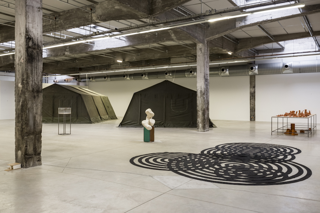
When Laurence Gateau approached me about organizing the exhibitions—one at their main space in Carquefou and the other at a satellite space called the HAB in downtown Nantes—it seemed natural to have the two shows be opposed and yet try to achieve something similar, something like a successful utilization of art.
I am very interested in the late turn of Marcel Broodthaers toward the notion of décor as a political statement on the failure of art, and yet a positive statement on what art is capable of, however limited its role in society might be. These exhibitions are a way for me to create a hypothetical scenario around that contradiction—to see what it might look like to pick up where Broodthaers left off, so to speak.
Stefano Arienti, Maria Loboda, Leonor Antunes, Lucy Skaer.
How did Broodthaers express this failure?
In a sardonic text published in No Photography Allowed, the book that accompanied his exhibition at the Museum of Modern Art, Oxford, in 1975, he stated that he chose “to consider art as a useless labor, apolitical and of little moral significance,” and went on to say: “Urged on by some base inspiration, I confess I would experience a kind of pleasure at being proved wrong. A guilty pleasure, since it would be at the expense of the victims, those who thought I was right.”
Could you tell us a little more about the notion of décor expressed by Broodthaers?
I think he saw décor as the epitome of the paradoxical nature of art—that art is timeless and symbolic and expressive, and yet is simultaneously quite ineffective as a tool for political action or social change. Broodthaers saw power in art’s weakness, i.e. it’s ability—meaning its inability—to do anything. Art is like Dr. Rieux in Camus’ The Plague, a man with limited capabilities trapped inside the walls of a hopeless situation, who nonetheless carries on as if his actions might make a difference. Because what else can he do?
Broodthaers expressed a similar sentiment in a text published in conjunction with his show at the Centre Pompidou where he wrote that, however weak, a political attitude is necessary today. He then quoted a statement that was made available to visitors at the opening reception on October 2, 1975: “In accordance with the artist’s wishes, as a symbolic gesture of solidarity with the Spanish Democrats, the opening of the exhibition will finish half an hour earlier than usual.”
Broodthaers was integrated in a group of artists labeled as “institutional critique” in the beginning of the 80’s. He was thus compared to Daniel Buren, Michael Asher or Hans Haacke who are artists that clearly integrated conceptual art’s strategy to produce pieces that aim at highlighting the power of institutions. Although Broodthaers did created a fake museum, his approach seemed more concerned with irrationality than demonstration. Is this position of an artist involved with political and theoretical questions but who remains an inspired artist, he was a poet after all, germane to your interest in Broodthaers?
I agree that Broodthaers was quite different from those artists, but perhaps it’s best if I speak for myself and not ventriloquize Broodthaers anymore. Next month, I will open an exhibition at Galerie Martin Janda in Vienna that will be a kind of “third leg” to the shows in Nantes. In the Janda show, I want to make a case for the value—indeed, the necessity—of deception in art. Institutional critique and its step-children, relational aesthetics and social practice, are all predicated on the belief that certain political truths can be revealed by framing lived experience as art. This is folly. Not because the political aspects of a given situation might not in fact be revealed by an artwork, but because as many if not more political aspects of the situation are buried in the process of the artwork’s making. Who has paid for the artwork, for example, or to what extent the community was or wasn’t involved, or who benefited from their involvement, or who the artwork was speaking to.
Just last week, the artist Tania Bruguera, as part of her installation at MoMA, arranged for a full-page ad to appear in the New York Times that stated “Dignity has no Nationality” in bold type on a yellow ground. This is a noble statement. But who is it for? Why is it in the New York Times and not, say, The Wall Street Journal or the National Enquirer? Was the space donated by the New York Times or did MoMA shell out $165,000 for the full-page ad? This is precisely the kind of self-congratulatory art world gesture that, through the direct delivery of a statement that seems factually correct, pleases everyone who already reads the New York Times and already agrees with it in form and content. But it has no bearing on those who might disagree with it, let alone the precarity of the human beings we can presume the statement is about.
I think fiction does a much better job of revealing the human condition than such presentations of “facts,” because fiction speaks to us indirectly—through absurdity or fantasy or the suspension of disbelief—and thus doesn’t fog our perception with a kind of legitimacy. That danger is not something that the concept of décor, for Broodthaers or myself, is capable of.
Bernadette Chéné, Hidetoshi Nagasawa, Nick Evans, Hab Galerie, 2018.
And how does fiction avoid or resolve these issues in the pieces you will show in Nantes?
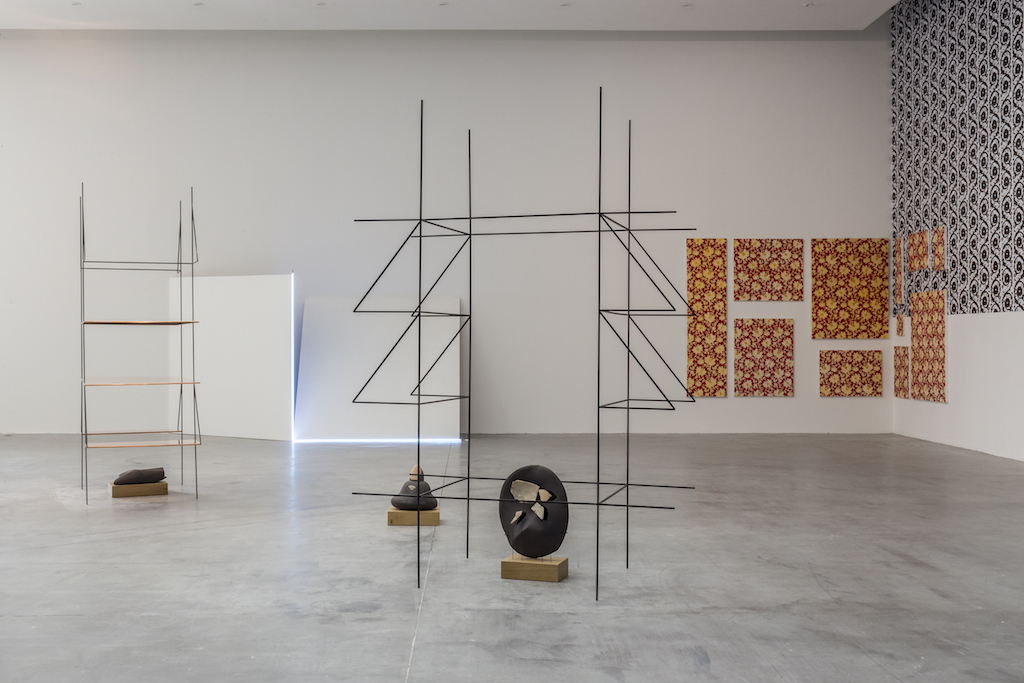
One example is a suite of eleven paintings by Béatrice Dacher titled La Maison où j’ai grandi (1998) that depict an elaborate, floral wallpaper. I have also designed an elaborate wallpaper for two opposing walls in Carquefou, and so there is a corner in the gallery where the wallpaper ends and a white wall begins. I had the idea to start the Dacher suite on the white wall and wrap it around the corner and onto the wallpaper wall. The straightforward fiction, so to speak, of her paintings of wallpaper becomes a kind of metafiction when hanging on the actual wallpaper. Béatrice was nice enough to agree with this handling of her work—when we asked her, she laughed and got it immediately.
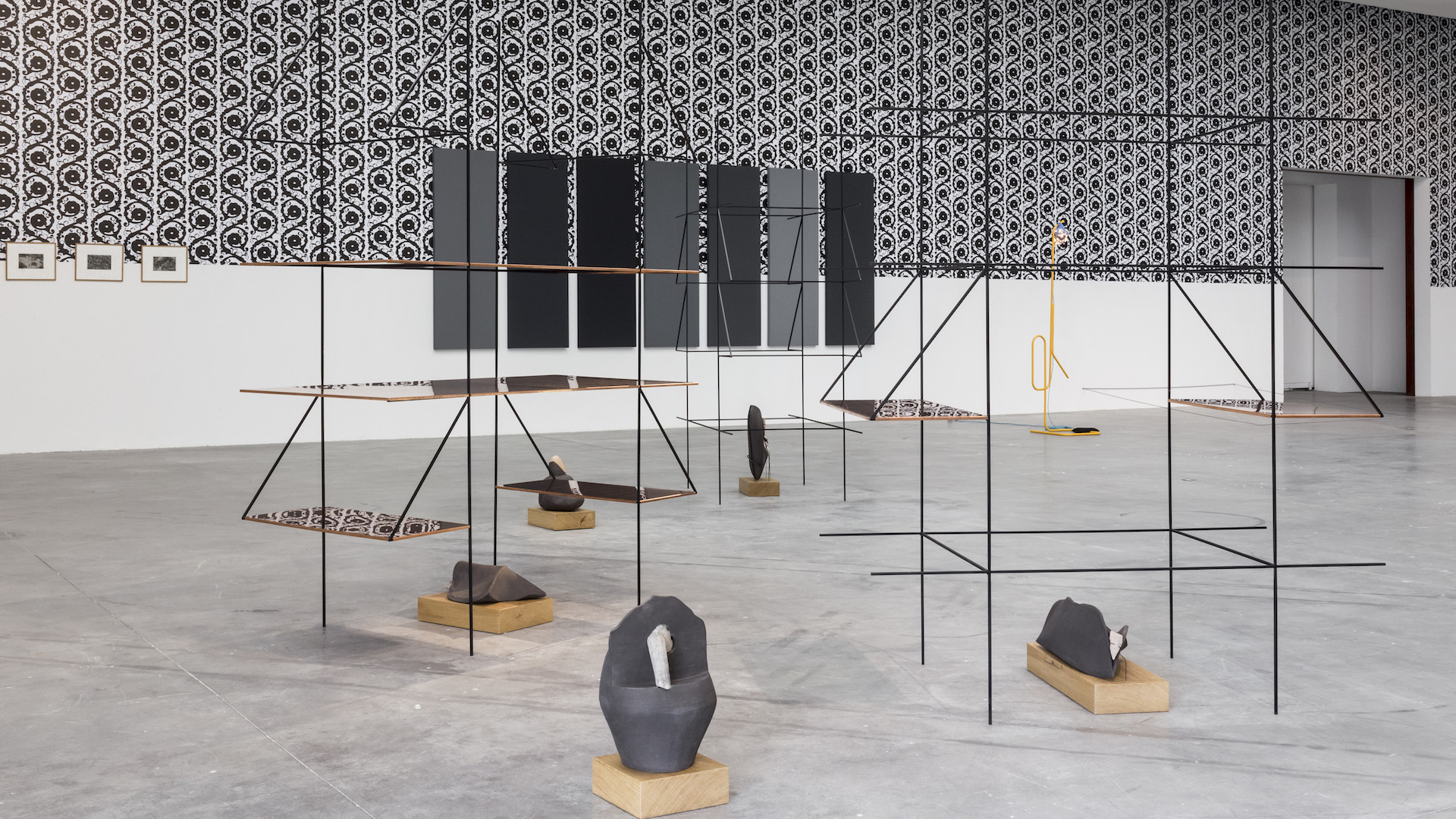
So in Carquefou, the wallpaper that I designed touches all of the works, directly and indirectly. It is an antidote that permeates everything: the critical spaces between Alan Charlton canvases, the mirrored surfaces of Kristina Solomoukha, the steel frameworks of Bojan Sarcevic and Martin Boyce. As décor, it has the odd effect of making critical works (like Charlton) more decorative, and decorative works (like Dacher) more political.
At the HAB, there is a different scheme in that the optimal aesthetic placement that the sculptures would normally receive has been negated by placing them all at the intersections of a 5m grid, no matter what their size or material. Like the wallpaper in Carquefou, this rigidity loosens up the sculptures and makes us more aware of their differences because they are all being treated the same, and that sameness highlights variations in size, material, and their relation to the body.
In general, I chose the works I chose because I thought they were rich and flexible enough to withstand either a decorative atmosphere or the rigidity of the grid. I suppose if we were really going to “stress test” the artworks, the next move would be to swap those in one show for those in the other. Alas, there is no time for that. The Frac must move on. Nonetheless, it has been rewarding for me to work this way with their collection.
Marcel Broodthaers, Nick Evans, Scoli Acosta, Jorge Satorre.
This idea that the pieces could fit in both ways of showing them seems to imply that the meaning of an artwork is not essential, that it depends on the context and tools for its interpretation. Is your show, as a whole, praising for volatility against interpretation?
No, because I think swapping the works would be a failed experiment. I like the idea of interpretive play, but I also believe it has limits. I’m all for finding out what those limits are, and, even more importantly, finding out how artworks and their original intentions might resist the kind of plays I am making. I liked Martin Kippenberger’s gesture of turning a Gerhard Richter monochrome into a table, not because it succeeded but because it failed. Even turned face up, and with four legs attached, the monochrome is still a monochrome. That’s not to say that Kippenberger’s gesture wasn’t worth doing—it was—but to say that it had the unintended consequence of reification. I wouldn’t mind if that happened with some of the artworks in these shows. Which is to say I wouldn’t mind being proved wrong.
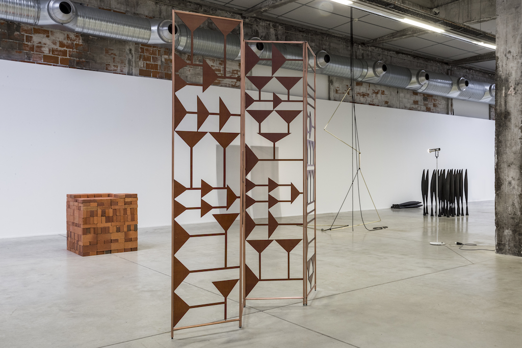
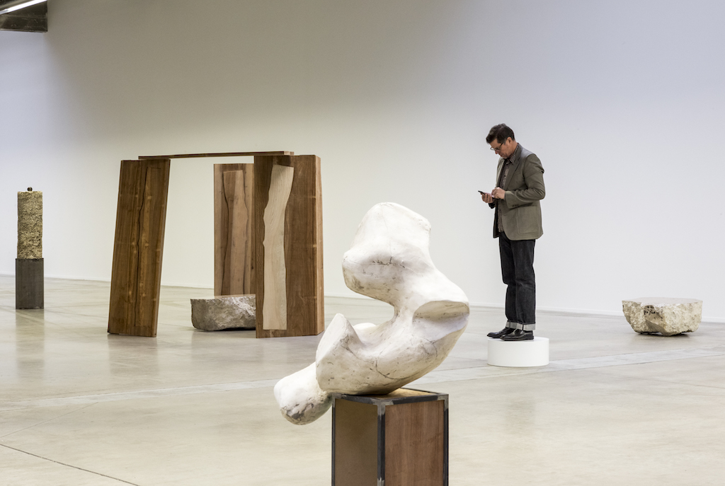
(Image on top and all images: View of the exhibition ‘Décor/Avant-poste’ curated by Joe Scanlan for the Frac des Pays de la Loire, photo : Fanny Trichet.)
Related articles
The Theatre of Cruelty (Theater of Cruelty)
by Patrice Joly
Interview with Perrine Lacroix
by Mya Finbow
Interview with Camille Richert and Clémence Agnez
by Clémence Agnez